Role: UX Designer
Team: Product Managers, Engineers, End-Users
Timeline: 6 Months (discovery to release)
Tools: Figma, UsabilityHub, Jira
From Pain Points to Purpose: Discovering the Hidden Bottleneck
Sometimes the smallest friction can cause the biggest headaches.
During user interviews at Anaplan,
I kept hearing the same grumbles: “Resizing columns is such a pain.”
Users managing giant datasets in
finance and supply chain were wasting up to an hour a week fiddling with column widths, dragging and
tweaking for what felt like forever. These professionals had bigger fish to fry than column resizing,
so I knew we had to fix this. In theory, it sounded like a quick win. However, even a seemingly small change had a lot of implications and complexities to navigate.
As you can see below, column width resizing was taking a while.
Users had to grab each column individually and manually resize them, one by one.
The obvious answer while observing this video would be to implement a shift select to target
multiple columns and resize them all at once. While this would be an improvement, it still leaves the process feeling slow and laborious.
What if we could resize all of these columns with one action?
The Real Innovation: Making Customization Feel Effortless
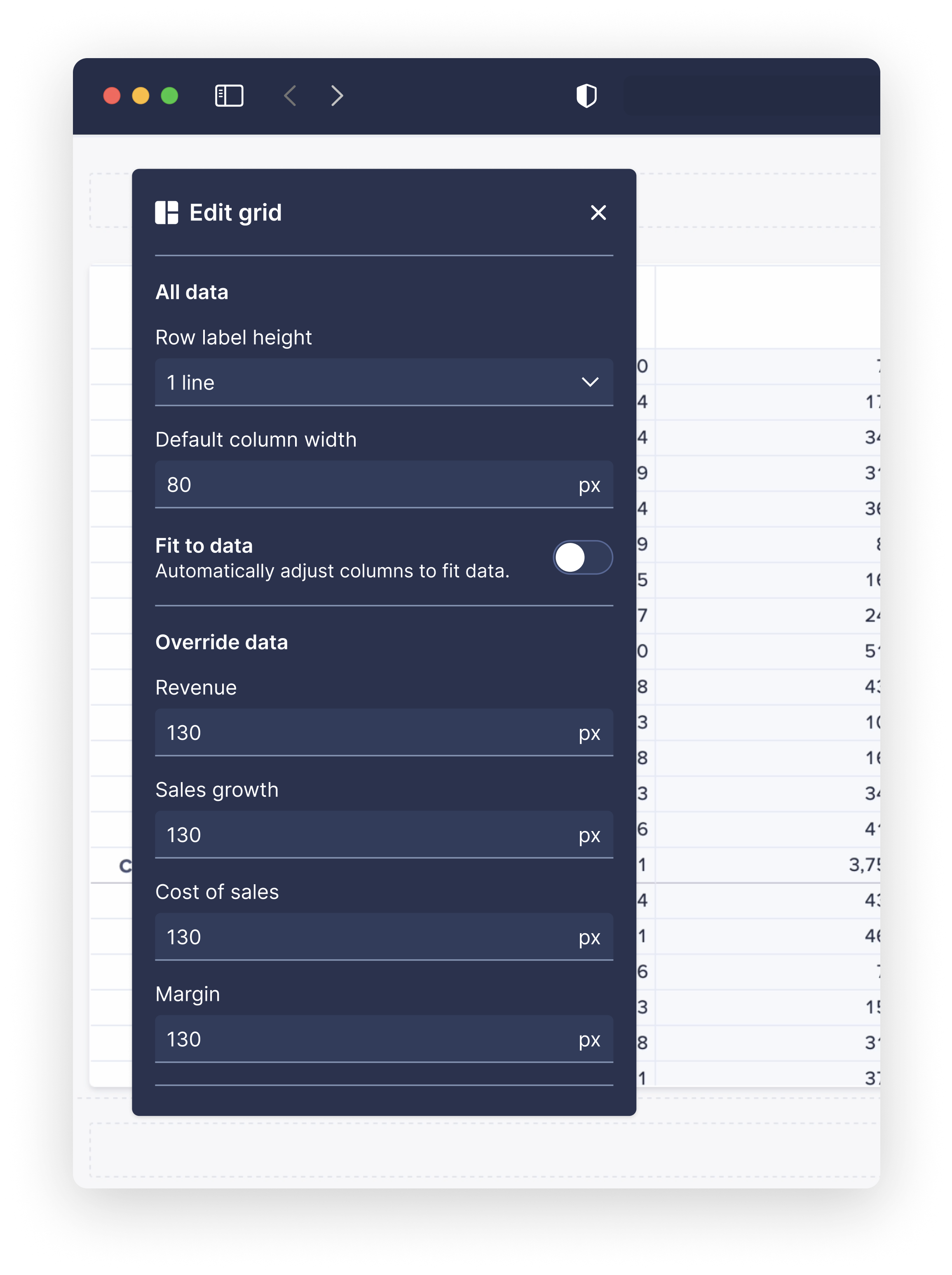
My vision was to make column width customisation feel almost invisible, intuitive, and lightning fast. Instead of forcing users to manually resize every column, I designed a right-hand panel that let users adjust widths while seeing the impact live on the grid. Type in a number, and bam, the grid updated instantly. No more back and forth between screens.
Lightning quick - here's what column width resizing looks like now:
As you can see from the clip above, this new customisation panel allowed users to set a width for all columns in one action!
The real beauty was in the real-time feedback. Users could type new widths, tweak them, and see the grid transform in front of their eyes,
all without leaving the task at hand. This made customisation feel intuitive and kept the focus on the data, not the design fiddling.
Users were able to fine tune the layout of their grid without needing to toggle back and forth menus or simply guess how the grid would look.
But hold on… how did we arrive at this solution?
Of course, good ideas meet real-world constraints.
When I shared the prototype with developers, they
raised a critical question:
How do we keep the grid responsive and stable while processing live updates?
Anaplan grids handle large volumes of data, so constantly updating in real-time could potentially slow down performance
or cause lag—two things our users couldn’t afford.
Cue whiteboard sessions, brainstorming meetings, and a lot of collaboration. We explored solutions to optimise the live updates, such
as refreshing only the specific columns in use rather than the entire grid. By working closely with the engineering team, we identified
ways to maintain the flexibility users needed without compromising the grid’s speed and responsiveness.
To validate our solution, we ran tests with early adopters, who praised the design for its smooth performance. One user even called it
“a game changer.” As a designer, that’s the kind of response you love to hear.
Catering to complex use cases.
The example demonstrated above showcases a pretty simple use case. But for features like these, although
they seem simple at first glance, you need to consider every possible instance and edge case.
For example, how should column width resizing behave when we have nested columns? i.e. two layers of columns.
Our solution was to make the lower (children) set of columns determine the size of the parent columns above. This meant that the
parent columns could only be resized by adjusting the child columns - rather than giving the ability to resize the two individually.
This was necessary in order to limit complexity and avoid breaking the grid.

Measuring our success - what was the real world impact?
We didn’t just rely on gut feelings to measure success. I ran time-on-task studies comparing the old manual method
with our new solution. What we found was amazing: users cut their resizing time in half, from an average of 30 seconds per grid to just 15 seconds.
That’s a 50% efficiency gain achieved by simplifying an everyday process.
Post launch, teams loved how easy it was to customize grids on the fly without having to guess at the results. One user said it best:
“Never has a seemingly small change been so important!”
Reflections: Building with Empathy and Purpose
So what did we learn from this?
First, never underestimate the impact of simplifying small interactions.
Second, this project reminded me that the best ideas don’t come from one person—they’re
built through collective insight. Developers brought perspectives that stretched the design
beyond my initial vision, and insights from users helped us shape a feature that solved real
frustrations. Collaboration here wasn’t just helpful; it elevated the design in ways I couldn’t
have achieved alone. Seeing the final product saving users time and energy was a powerful reminder
of why building together creates lasting impact.
