

HERO® is on a mission to make eCommerce human. Our #1 virtual shopping platform connects millions of shoppers with product experts via text, chat and video, all directly from a brands ecommerce store. This is how Levis, rag & bone, Herman Miller and over 200+ of the worlds best brands bring the IRL experience online, driving sales and increasing average order value.
Hero was acquired by Klarna in 2021.

The work in this project was completed independently, with work regularly being presented to the wider design team to gain feedback and develop ideas further.
The role included analysing existing research insights, design exploration, and validating and iterating design ideas.


How might we...
Encourage better quality chats that are likely to be converted to sales?
Adapt the launcher plugin to the different stages of the shopper journey?
Educate people on the capabilities of Hero - e.g. convey that Hero allows you to talk to real people?
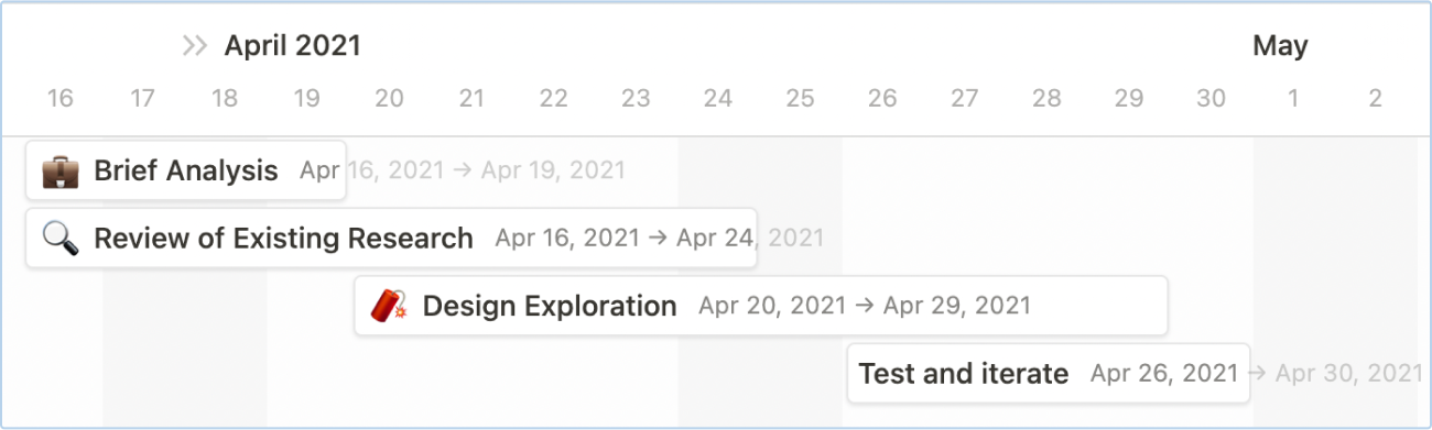
The project was planned out over a two week timeline. As the focus was exploring new entry points for the launcher, I structured my process around enabling as much discovery and creativity as possible.
Research review, design exploration and iteration had significant overlap - a non-linear process is more effective in guiding a more considered outcome.
I used notion to plan the general structure of the project, to guide my workflow throughout and ensure I stayed on track.
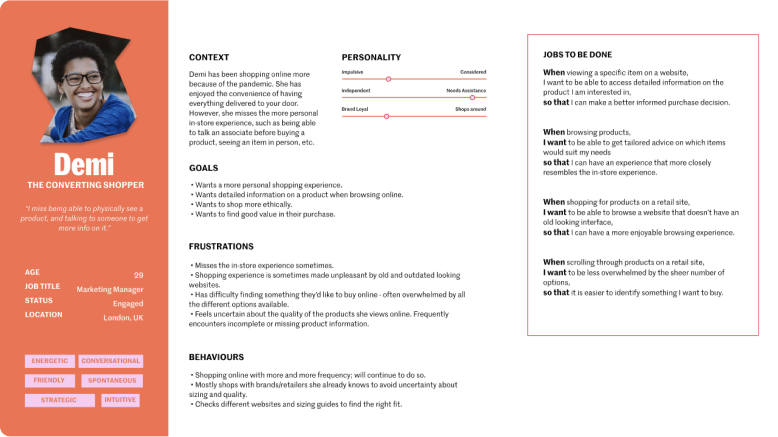
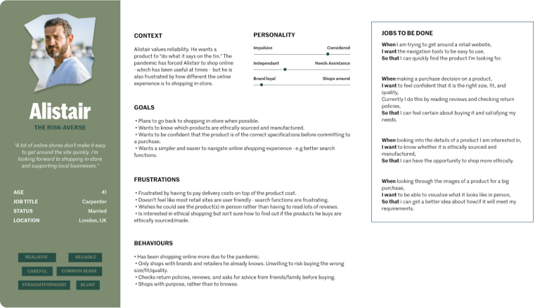
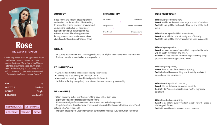
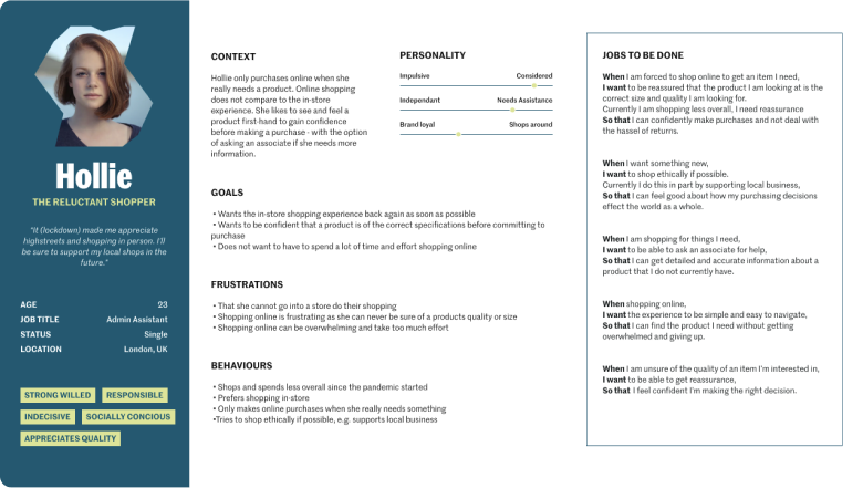
I reviewed and analysed existing user personas I had previously created with my colleague.
From these it became clear that different shopper groups had different needs at different stages of the shopping journey.
My next step was to break down these needs in order to gain a clear picture of how I could better engage shoppers with a launcher redesign.
This exercise allowed me to think more critically about the existing shopper experience.
By breaking down their experience into stages and mapping out the needs during those stages, it gave me a much greater foundation to start designing well-considered solutions.
I mapped the shopper journey into three key stages:
Inspiration, exploration, and education.
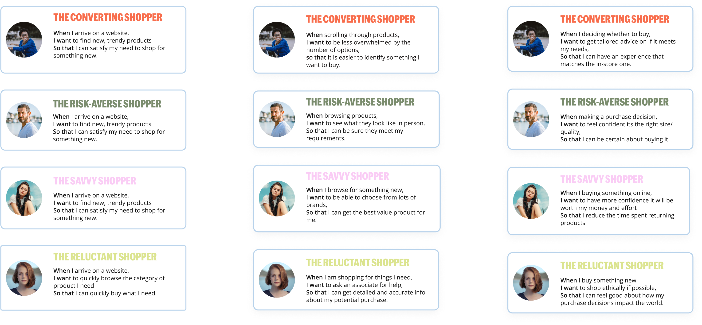
Using existing data, I created user stories for each individual shopper group according to what their needs were in each stage of their shopping journey.
This formula allows me to design in a way that I can be confident will be most impactful to the user, as every user story is backed up by concrete data.
I used this work as a reference point throughout the project.
It was important to consider the needs of both the retailers and the shopper. Retailers will ultimately make the final call on whether a design is implemented or not.
Is it an efficient use of space? Can it fit within the existing framework of the website?
The final designs should be able to adapt to the constraints of different retailer sites.
Consider how much set-up each idea would require on the retailer side.
This is a part of the process that I always approach in a way that will be the most fun. It’s a chance to let your creativity do the talking, so I think it’s imperative to create an ideating environment that allows you to relax and let loose.
It’s also extremely satisfying to quickly mock up different ideas and have that “eureka” moment along the way.
Key words
I identified key words and phrases that represent the project goals, and designed around those. e.g. “more human” “personal,” “clickable” “inspiring” “real people” “engaging”.
Crazy 8s
I quickly mocked up eight different potential ideas - spending just a minute on each one. As this was a solo project, I then spent time evaluating each idea against the project goals, and used this as a starting point for the design exploration.
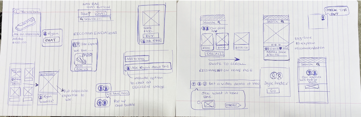
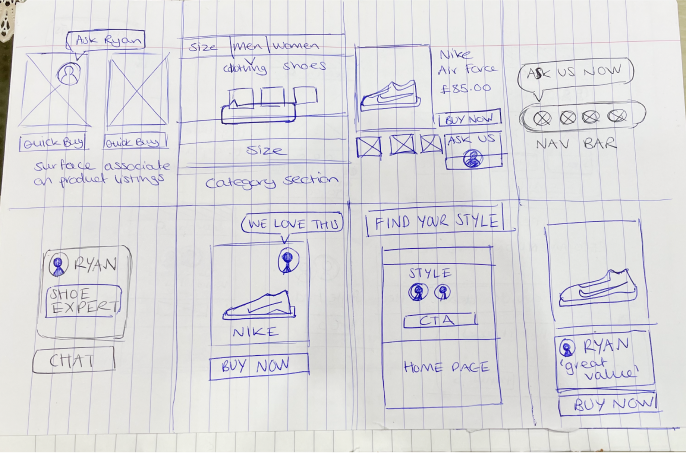
Throughout this phase, I really wanted to come up with ideas that completely eliminate the perception that Hero is a chat or customer service bot.
To achieve this I mocked up entry points that engage the user in different ways, rather than just being a chat plugin in the corner of the page. I explored the home page, category page, nav bar, and even the product tiles themselves.

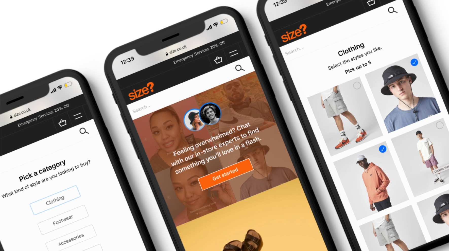
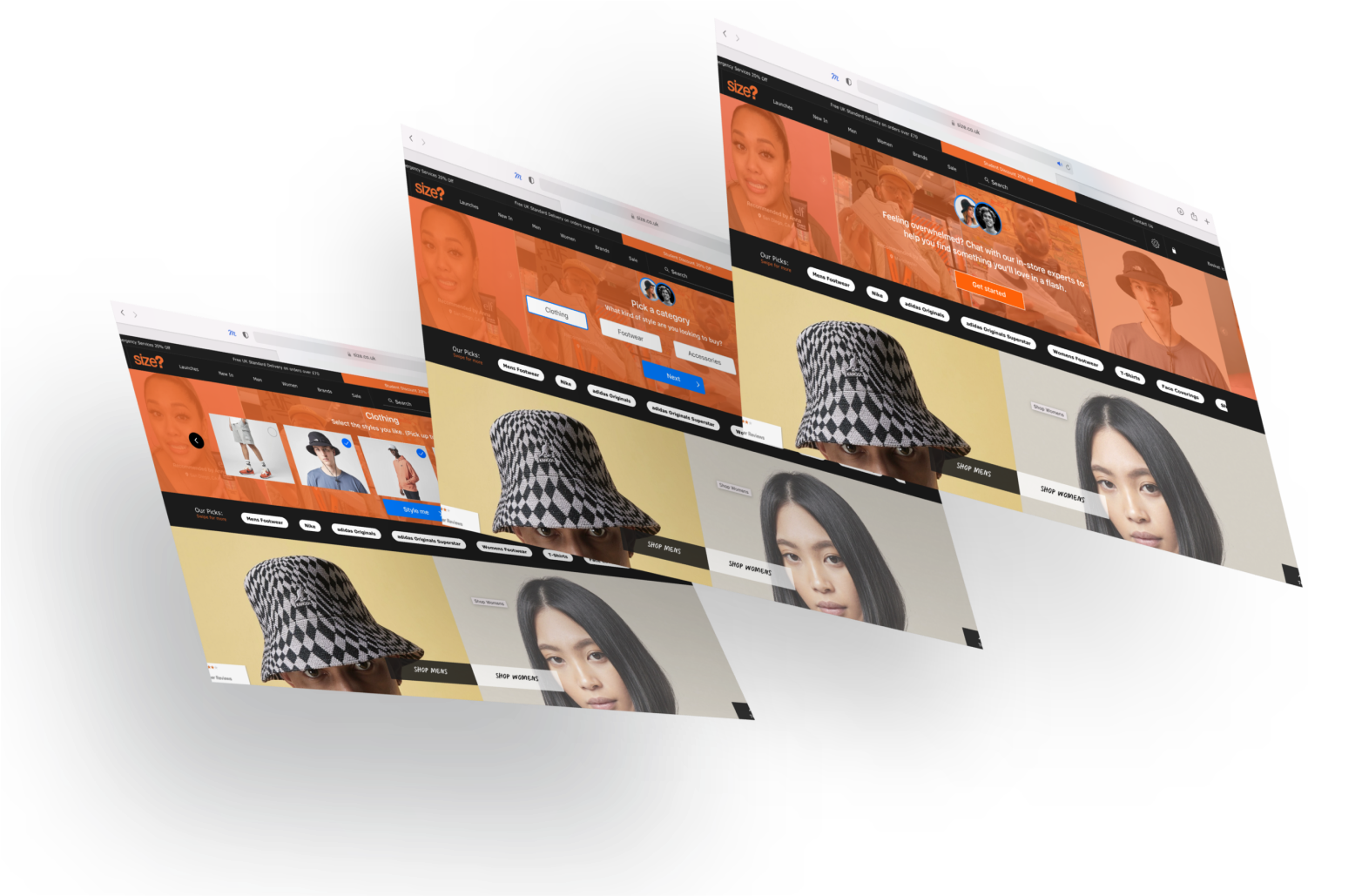
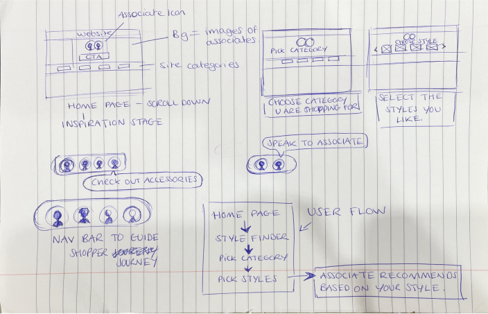
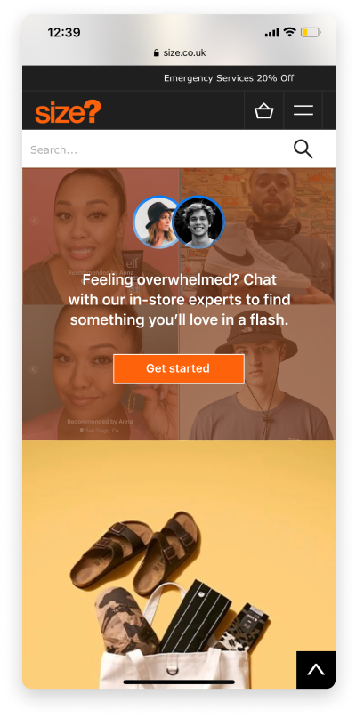
My final design was this style finder. This seeks to really educate and show off the capabilities of Hero by putting the associates at the forefront - encouraging the users to see these are real experts.
It also guides the shopper journey from the beginning, which is something the existing Hero launcher plugin lacks. This represents a complete shopping experience that moves closer to the IRL one.
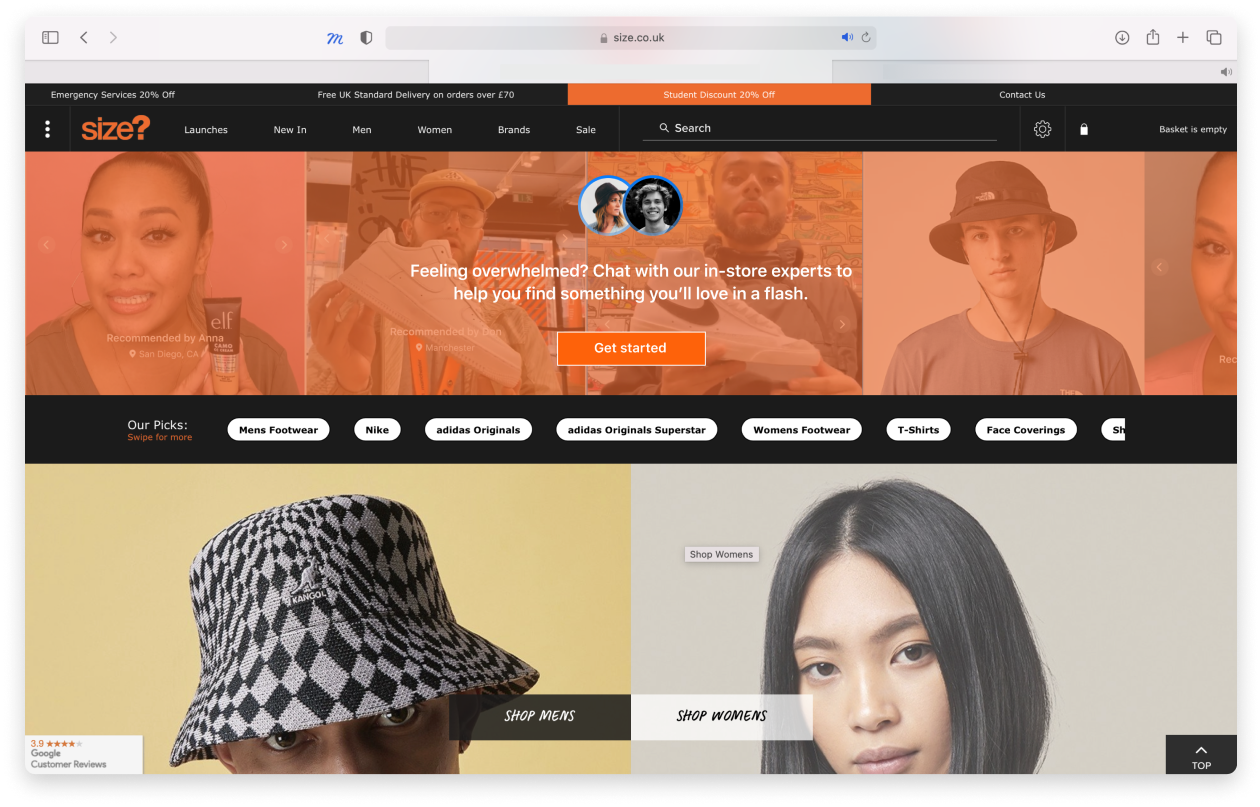
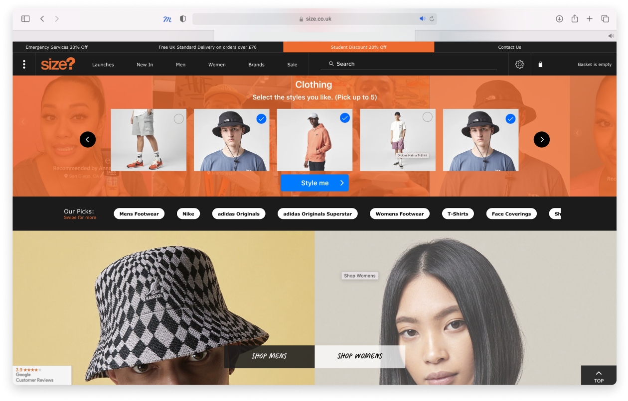
The style finder can be accessed on the home page. It is found by scrolling down slightly.
Associate avatars and engaging copy is utilised to give a more “human” feel.
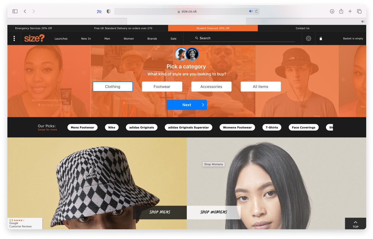
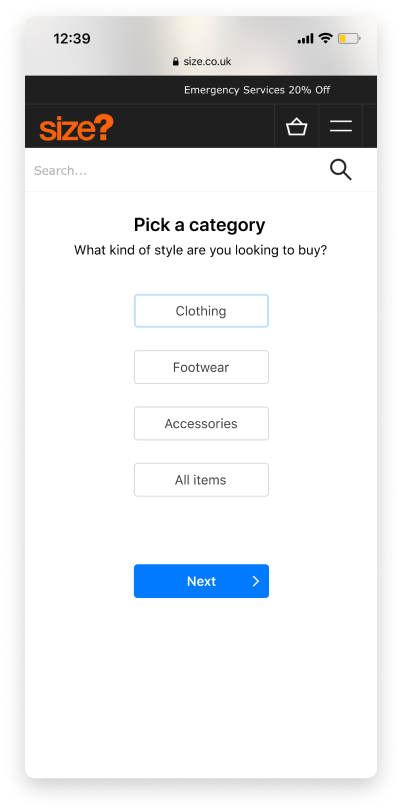
The user can now pick the category they are shopping for. Alternatively, they can choose to pick styles from all categories.
The user is now in charge and gets to take part in an engaging exercise that allows them to pick their five favourite styles - this information allows the associate to make recommendations to them.
I chose to limit it to five styles as this ensures the associate is not overwhelmed by all the information sent to them - and allows them to make a better informed recommendation.
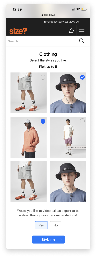
Once the user has selected their favourite styles, the Hero chat opens.
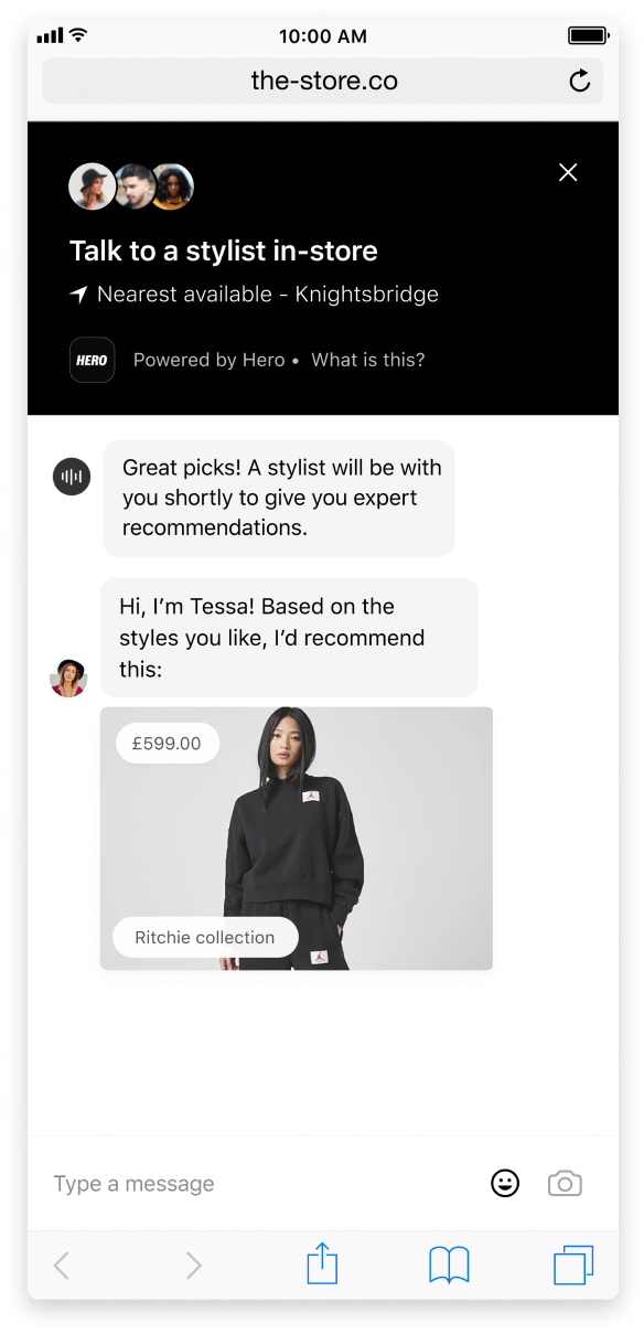
Using the styles the user has selected, the associate is then able to make recommendations based on the user’s specified needs.
This also benefits the associate - as it starts a chat that they are more likely to convert into a sale.
It was a challenge balancing the needs of both stakeholders - retailers and shoppers. The shopper needs presented an opportunity for something completely new and inspiring, but this didn't guarantee that it would be accepted by the retailer. To deal with this challenge, I regularly communicated with the engineers to have a good grasp of the technical viability of each idea.
Making the design responsive. It was crucial that any design proposal worked well across website and mobile.
The project timeframe was short - one sprint/two weeks. Because of this, the final outcome has limitations - it is likely to need further iteration once more testing is carried out.
